You’ve got about 3–5 seconds to make a first impression.
If your homepage doesn’t hook your dream client before they scroll… you’ve already lost them.
And here’s the kicker: it’s not about being flashy.
It’s about being clear.
What lives above the fold on your homepage is the most valuable real estate on your entire website. This small but mighty section sets the tone for the entire user experience—and it can be the difference between someone bouncing or booking.
Let’s break down exactly what to include above the fold, what to avoid, and how to make that space work harder for your business.
Wait—What Does “Above the Fold” Mean?
“Above the fold” is just a fancy way of saying:
What someone sees on your site before they scroll.
On desktop, that’s usually your header, hero section, and main CTA.
On mobile (which accounts for more than half of website traffic!), it’s often even tighter—sometimes just a headline and a button.
This is where you answer the big questions fast:
- What do you do?
- Who is this for?
- What’s the next step?
The goal? Show your visitors they’re in the right place and you can help them—within seconds.
Why Above the Fold Matters So Much
Think of this section like the front window of a shop.
If it’s confusing, boring, or off-brand, people will walk on by.
But if it’s clear, compelling, and emotionally resonant? They’ll come in, stay longer, and take the next step.
In fact, studies show that users form an impression of your website in less than 1 second—and the above-the-fold content plays a major role in that impression.
This one section does a lot of heavy lifting:
- Builds instant trust
- Communicates your value
- Sparks curiosity
- Encourages action
So let’s make it count.
The 5 Essentials of a High-Converting Above-the-Fold Section
- 1. A Clear, Client-Focused Headline
Your headline is your first (and maybe only) chance to grab attention.
It should speak directly to your dream client’s problem, goal, or desired transformation.
Avoid talking about yourself here. This isn’t the place for “Hi, I’m Jess and I’m a life coach.”
Instead, try:
Helping overwhelmed creatives reclaim their time and joy—without burning out their business.
Or:
Done-for-you websites that help women entrepreneurs book more clients (without the tech drama).
- 2. A Subhead That Builds Connection or Curiosity
Your subheading can do one of two things:
- Add empathy and depth
- Clarify what you offer in simple terms
It’s your chance to reinforce your positioning without getting wordy. Think of it as the supporting actor that helps your headline shine.
Example:
You’ve got a big vision—but your website isn’t pulling its weight. Let’s change that.
- 3. A Strong, Benefit-Driven CTA
Yes, you can invite someone to take action right here—before they’ve even scrolled. This action should be whatever the next step is to working with or buying from you.
Your CTA might be:
- “Book a Free Consult”
- “See My Services”
- “Download the Free Checklist”
Make it a button, not just a text link. And don’t be afraid to show up strong—if your offer is clear and your message lands, people will respond. They may not click — yet! — but they will understand a clear path to the next step.
- 4. Visual Hierarchy That Guides the Eye
This is where design matters.
Your layout should:
- Be clean and uncluttered
- Use spacing and typography to make reading easy
- Highlight the headline and CTA without distractions
Avoid putting too much in this space. One message. One action. That’s it.
- 5. Optional: On-Brand Imagery or Visual Cue
You don’t need a photo—but if you use one, make sure it supports the message.
Think:
A photo of you looking into the camera, or a visual that subtly reinforces transformation or connection.
Avoid:
- Stock photos that scream “generic business lady”
- Graphics that compete with your message
- Sliders or autoplay videos (more on that below)
- Important text messaging inside an image (this doesn’t meet accessibility standards)
Common Above-the-Fold Mistakes to Avoid
Even if you’ve got the right elements, execution matters. Here’s what to steer clear of:
“Welcome to My Website” Headlines
This says nothing and wastes prime attention space. Your headline should show the visitor’s problem or desired outcome.
Hidden or Weak CTAs
If your button is tiny, blends in, or says something vague like “Learn More,” it’s not doing its job.
Too Many Choices
Decision fatigue is real. Don’t give someone five buttons to click. Focus on one goal for this section.
Sliders or Carousels
They’re trendy, but they kill conversion. People don’t wait around for your next slide to appear. Just say what you need to say, clearly and once.
Visual Overload
If your above-the-fold looks like a collage, no one will know what to focus on. Simplicity sells.
Real-World Example: Before & After
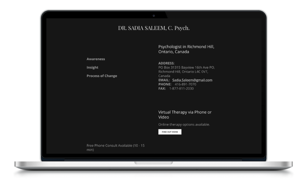
Before:
A plain (but clear) above the fold section. It provided information but no opportunity for connection.
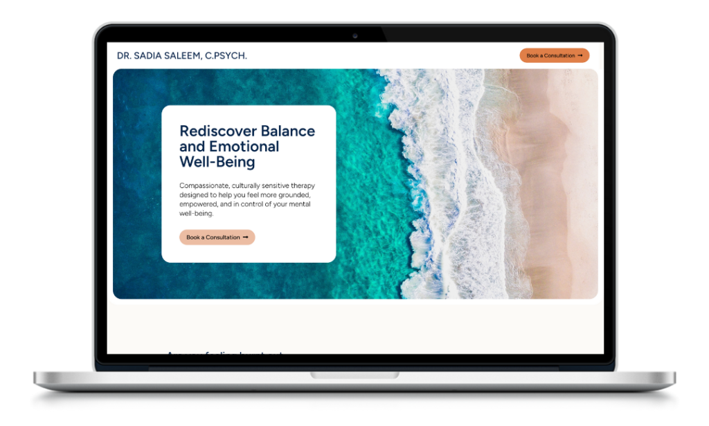
After:
- Headline: “Rediscover Balance and Emotional Well-Being”
- Subhead: “Compassionate, culturally sensitive therapy designed to help you feel more grounded, empowered, and in control of your mental well-being.”
- CTA: “Book a Consultation”
- Clean layout, one strong brand photo, clear messaging hierarchy
The result?
A conversion rate of 28% and a steady stream of one to three well-qualified inquiries per month.
How We Fix This in Every Rad Lady Website
At Rad Lady Enterprises, we don’t guess what should go above the fold—we design it with intention.
In both our LaunchPad and Momentum packages, we start with strategy:
Who’s your client? What do they need to feel and know right away? How do we make it effortless for them to take action?
We’ll guide you through:
- Messaging clarity
- Design that supports the message
- Clear CTA placement
- Mobile-friendly layouts that convert
No more website shame. No more guessing. Just a homepage that works.
Your Next Step
✨ Want to know if your homepage is hurting your conversions?
Download the Website Red Flags Checklist and get clarity on exactly what to change above the fold (and beyond).
Discover whether your website is making you money:
→ Is Your Website Just Pretty—or Is It Profitable?